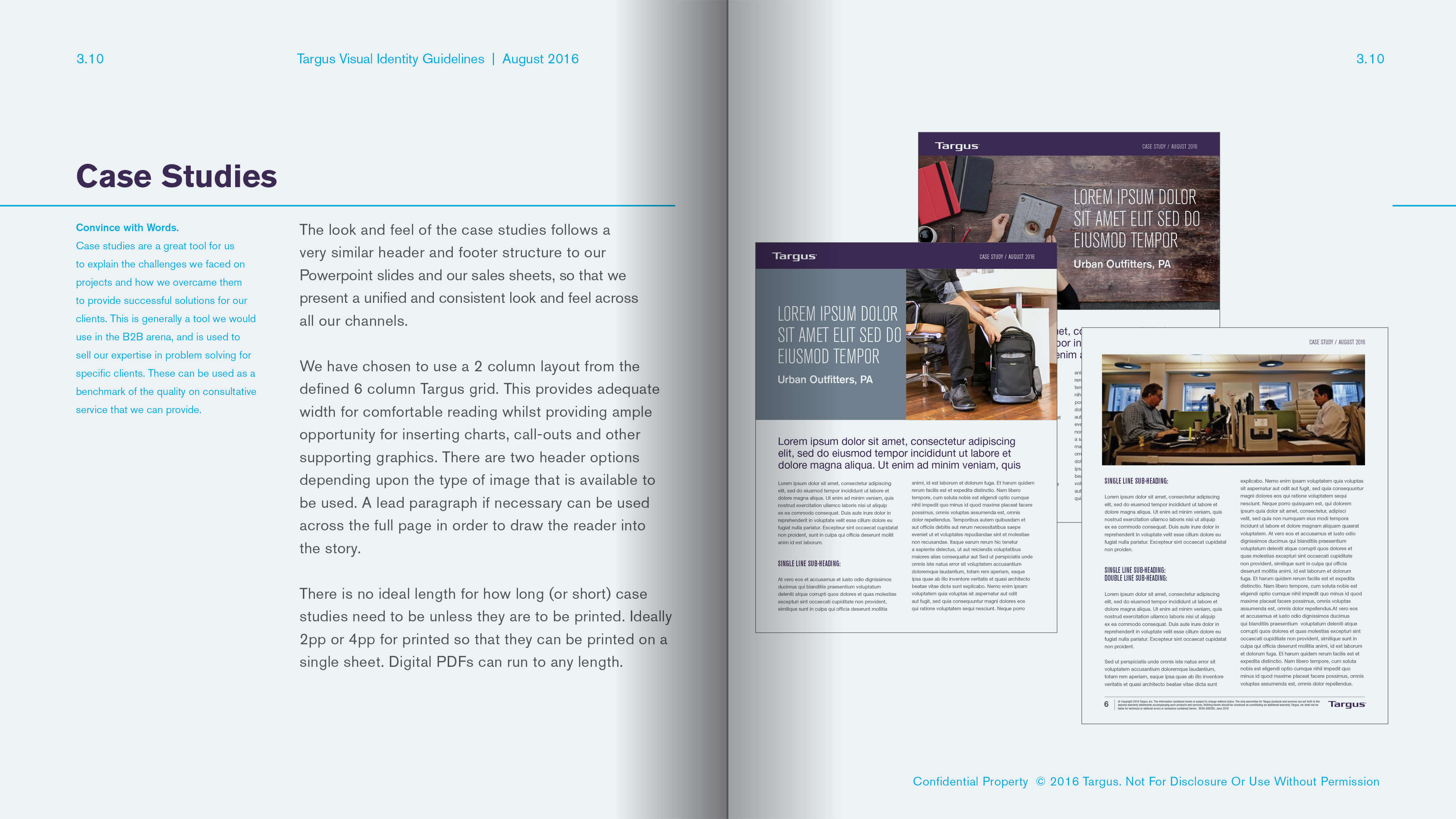
logo

TARGUS

Targus approached us with an interesting proposition. They needed someone to get under the hood of their brand, assess it, audit it, and start to craft some rules that would pull it all together in a cohesive way that made sense without disrupting everything that had been done to date. Through various channels and departments we uncovered areas that were fractured through multiple stakeholders and workers customizing templates and the like, for their own ends. By crafting rules that gave existing elements a raison d'etre and a position and logic in the heirarchy, refining where necessary, and crafting new rules where non existed, we were able to pull together a series of brand books, powerpoints, infographics, marketing tools, and digital tools that spoke with a common voice through a simple streamlining process. That process we have now named as BrandTuning™.

Work displayed with the permission of Targus.

DESIGN RULES AND HIERARCHIES

Targus had already been using specific logo versions, colors, and typefaces on their packaging and printed collateral, but there really hadn't been an exploration into the relationships between which typefaces, the scale they were used at, and the specific intent of the choices relative to the verbiage/content and the positioning of the logotype. We set about assessing current usage and then re-crafting and documenting those relationships in a much more robust manner, correcting some of the choices and usage, to make the applications much more consistent acrosss the board.

DATA-DRIVEN VISUALIZATION

One of the largest elements of the communications was the use of statistics. These generally weren't presented as 'heroes' within the context of written and illustrated media. By elevating their presence within data-driven visualizations, and infographics specifically, we were able to strengthen the intent of each element. The infographics had a very typical illustrative style, but the original color choices weren't gelling with the overall look and feel of the brand. By simplifying the palette, and exploring two variations of the art we were able to pull the illustrative form back on track without the need to correct the overall rendering style. There was also the introduction of a photographic/infographic style, which had not been used before but helps to further 'blur' the lines between data, illustration, and imagery. Point being - we wanted the client to think about the overall vehicle for the message rather than executing for a specific channel.

ICONOGRAPHY & ILLUSTRATION

Targus already had a huge repository of iconography and illustrations. Upon first look there didn't seem to be too much correlation between the styles but as we explored deeper and started organizing the content into levels, usage, and styles, a general order started to appear. Along with the inclusion of the keyline version of the infographics as seen above we were able to start to connect the dots between all the styles so that there was a consistent evolution and raison d'etre for which style was used and where. The compartementalization of the styles established a clarity of usage that had not been seen in the past.

IMAGERY

Around the time we started working with Targus, they were already branching out into a more lifestyle oriented, and softer product focussed type of imagery, as would have been our recommendation. Depending upon the market B2B or B2C would clearly have an impact on the content of the imagery. So we crafted a series of guidelines for composing and shooting imagery that took into account 5 specific considerations, and compositionally would allow for multiple crops for multiple usages. We also recommended 3 different tiers of imagery that could be utilized depending upon budget and intent.

COLLATERAL

In the original tool kit we had developed a 6 column grid to be used on all collateral, from case studies, to powerpoints, to trade ads, and catalogs. The flexibilty of the grid meant that we could use different 1, 2, or 3, column layouts (and sidebars if necessary) in order to better serve the content and in doing so it allowed us to preserve as much white space as possible. Generally in this market the companies for some reason feel the need to overload the page with content and tables and charts, and that was something we were cognizant of moving away from. Galley-Setting was used to give a rough word count for future content development. There's nothing worse than shoe-horning content into spaces it doesn't want to go. And if the collateral was to be digital, then having additional pages was not something to be afraid of.

DIGITAL

Finally, how do we take all this new look and feel into the digital channels? It was relatively simple to match 2 googlefonts to the corporate typefaces, rather than go the subscription route (which we were told was a no-go). Everything was laid out and specified for a responsive framework. Go to targus.com to see the new site layout based upon our guidelines. Below you can see examples of product specific email layouts and a product category landing page, which were designed to be much more consistent using a combination of the elements shown earlier on this page. Again these assets were generated to be used as ingredients in an overall recipe, not to be used in isolation, and in doing so we builds a much more credible brand world that is more attractive and engaging to both target markets.

POWERPOINT

Ahhhhh Powerpoint. Don't we all just love it? It's amazing globally how powerpoints get bastardized over time within an organization. We built, from scratch, a new master template comprising of around 50 master slides (10 covers + 10 layouts in 3 colorways + additional product pages) using our 6 column grid. In using this template as a road test we built the corporate master decks and the company positioning document. These visually should be used as a primer for the professional look and feel of all Targus Powerpoint or Keynote decks. Powerpoint doesn't need to be 'death by bullets'.