SCRIBEWISE
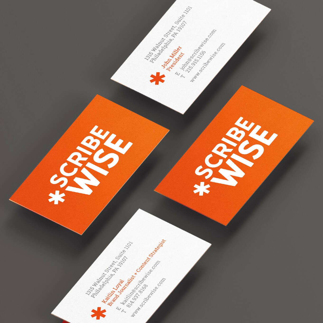
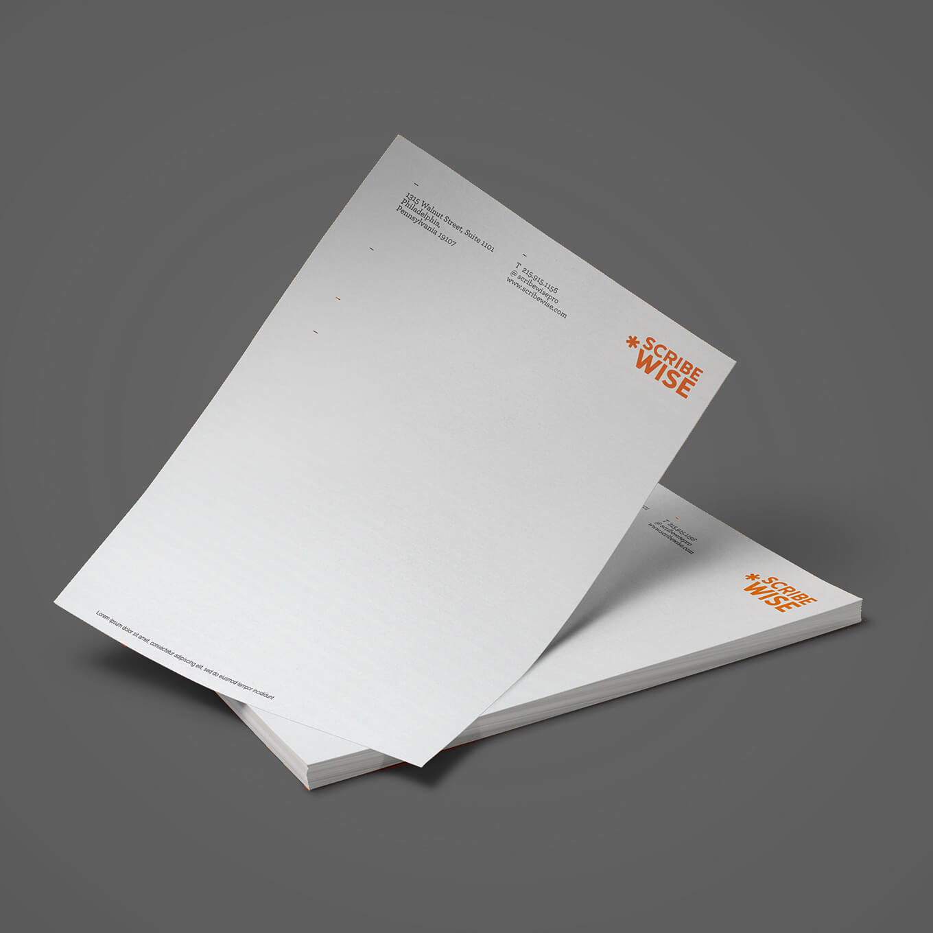
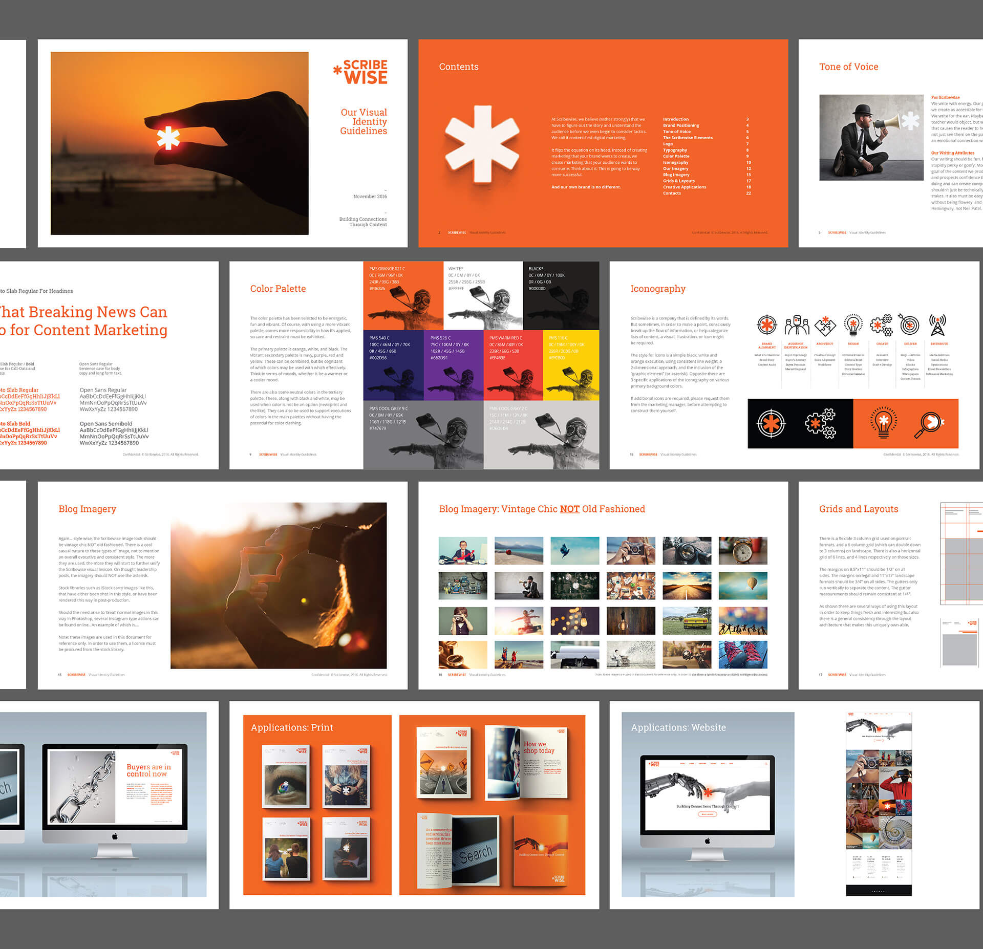
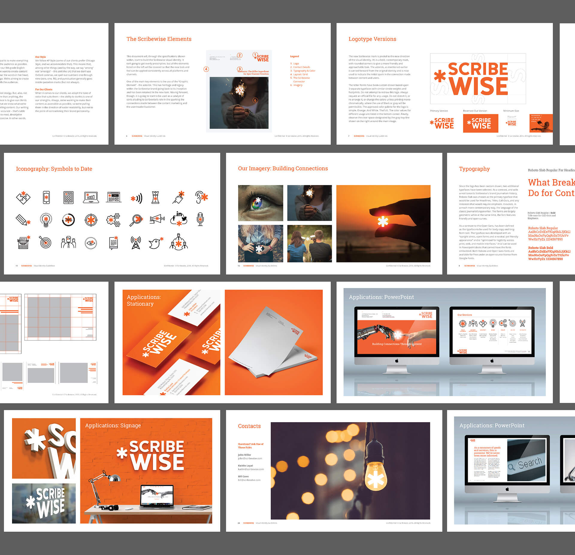
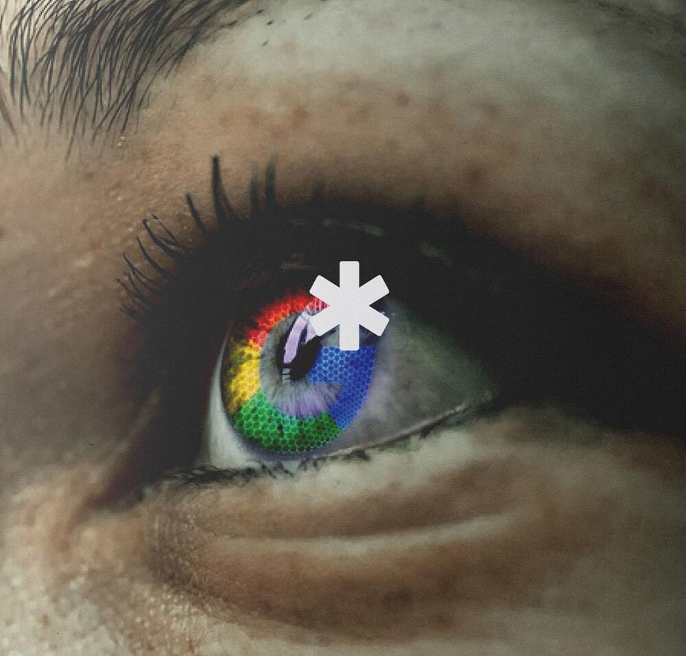
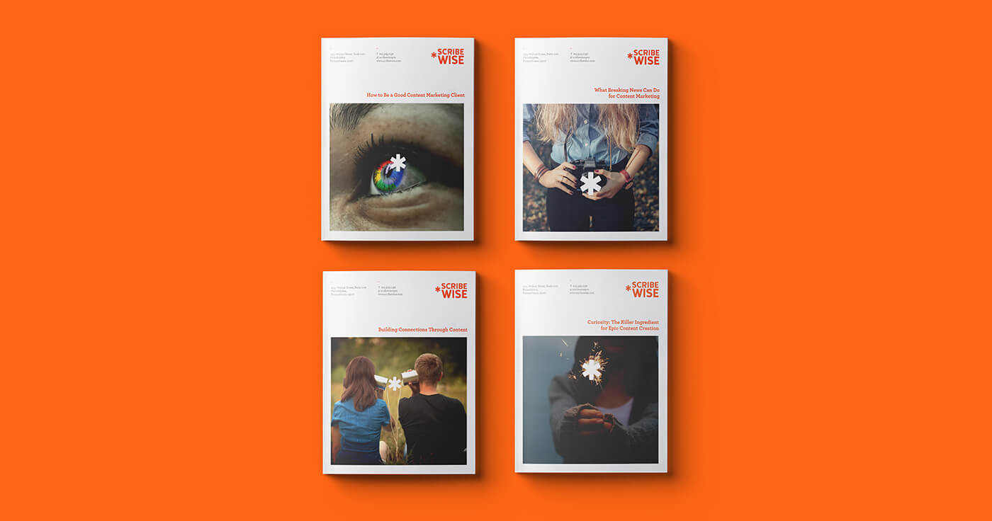
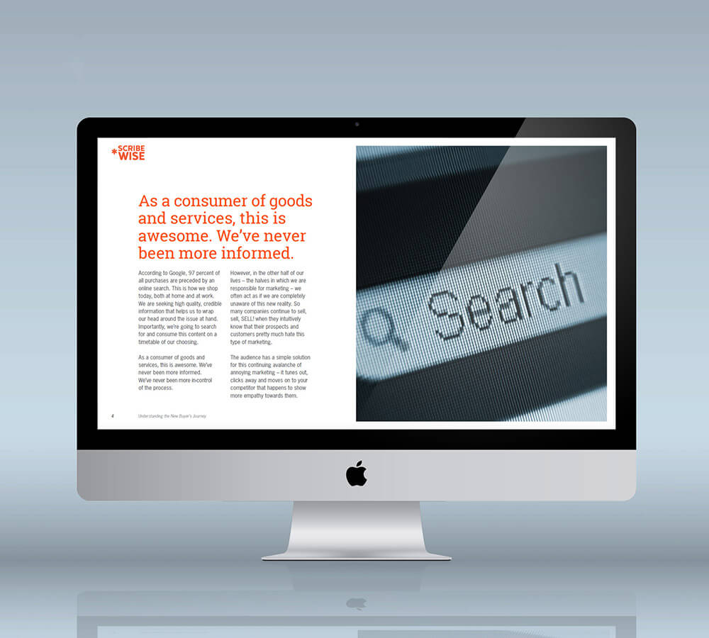
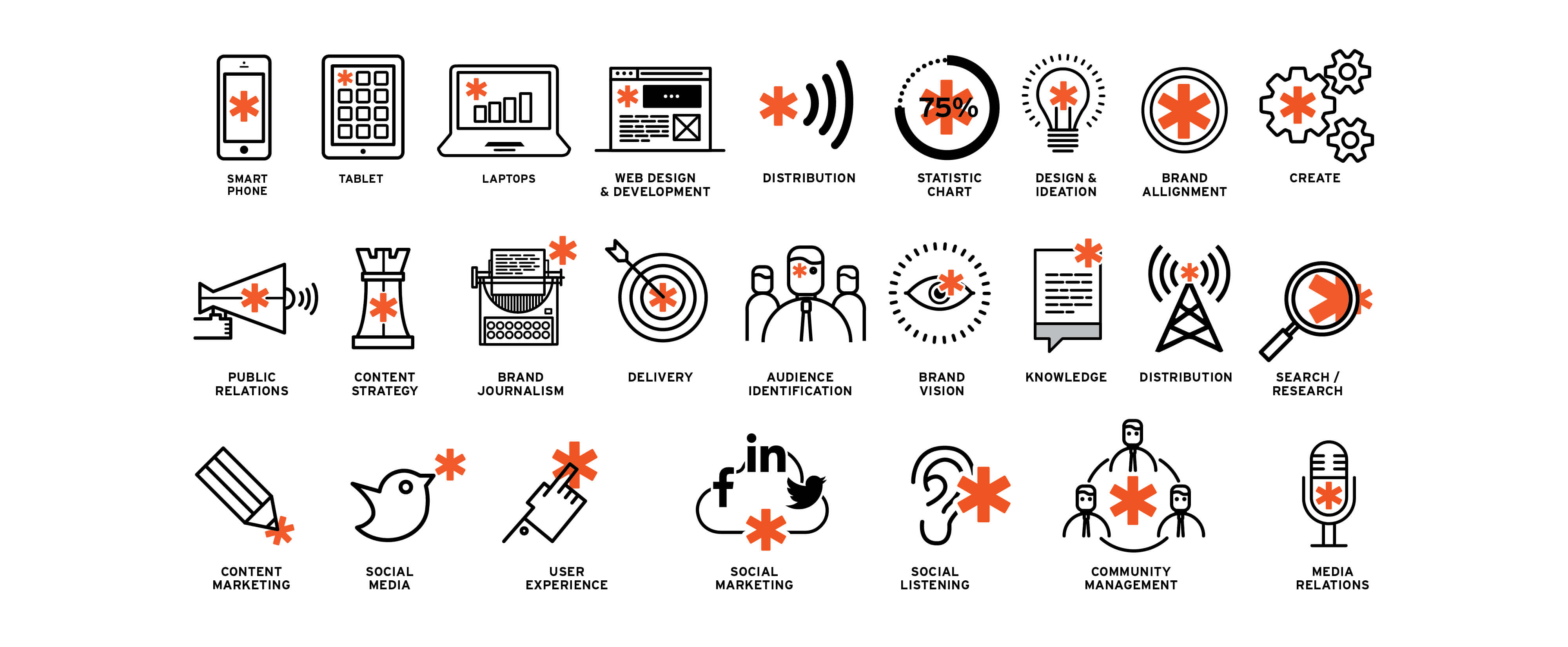
Scribewise are a Philadelphia based content marketing company. After some significant changes to their business, they felt it was time for a change. The CEO had designed the original logo and to be fair to him, it looked like it. But there was some equity in it. The bright orange color and the asterisk - so those elements were retained in the rebrand. The typeface is custom drawn, with rounded corners to soften the overall boldness of the new look. The asterisk would be used as a graphic element to indicate the role scribewise plays in 'connecting' people; the spark, or catalyst for beginning conversations. A slab serif was chosen as the contrasting main typeface and a series of fun, graphic icons were developed alongside an overall image strategy for their thought leadership posts.


