JESSOPS
This project turned 18 this year. It was the first brand manual that Limepickle owner Jenksy wrote (while working at agency Crabtree Hall in London) and surprisingly it is still being implemented with very little having changed. Good design needs to stand the test of time.
The project blurb:
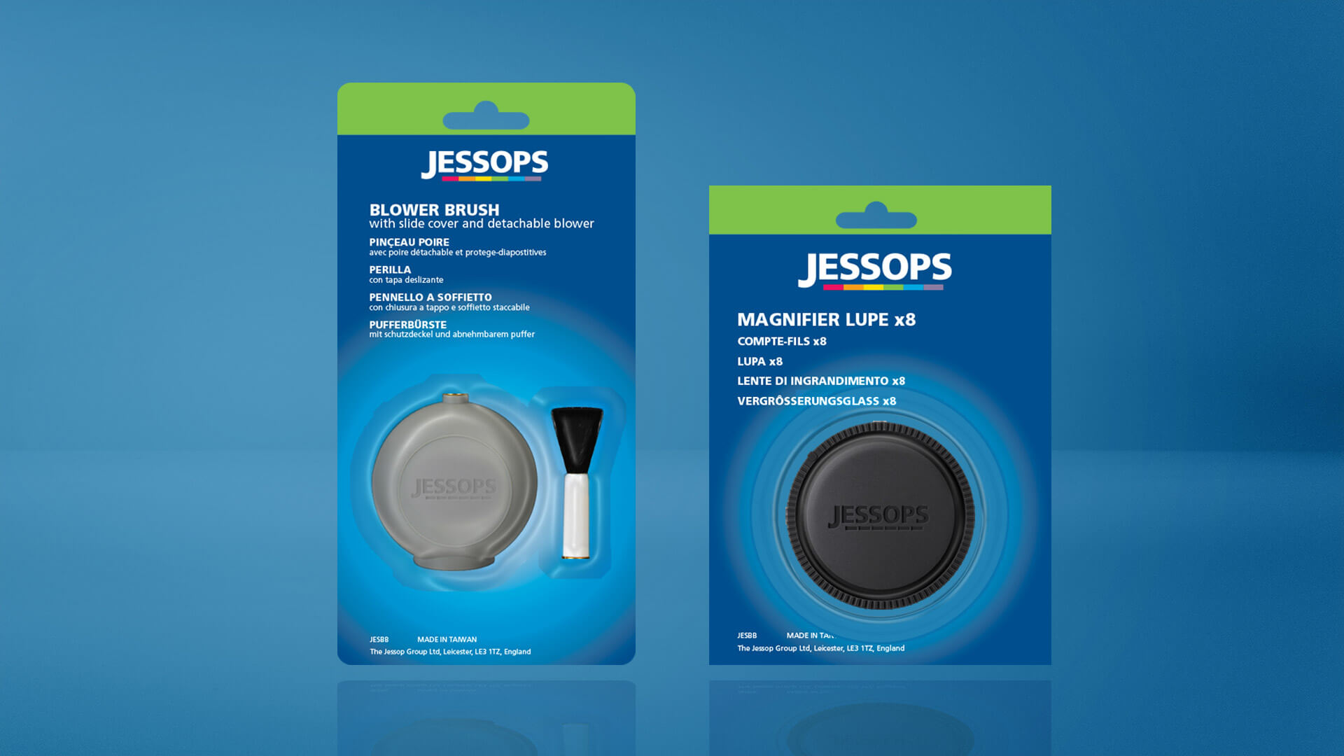
Jessops are the UK's number 1 specialist photographic equipment retailer. After giving them a new identity and improving in-store communications, they required a redesign of their own brand packaging. This extended to over 1000 lines. In undertaking this, several production isssues had to be solved. By reverting to a straight 4 colour process, the inconsistencies from third party printers was eliminated. The corporate blue had to be retained so a lens flare was introduced to help lighten the background. This improved the visibility of products in blister packs. Products were now to be categorised and colour coded, which allowed block merchandising in-store, strengthening the offer.