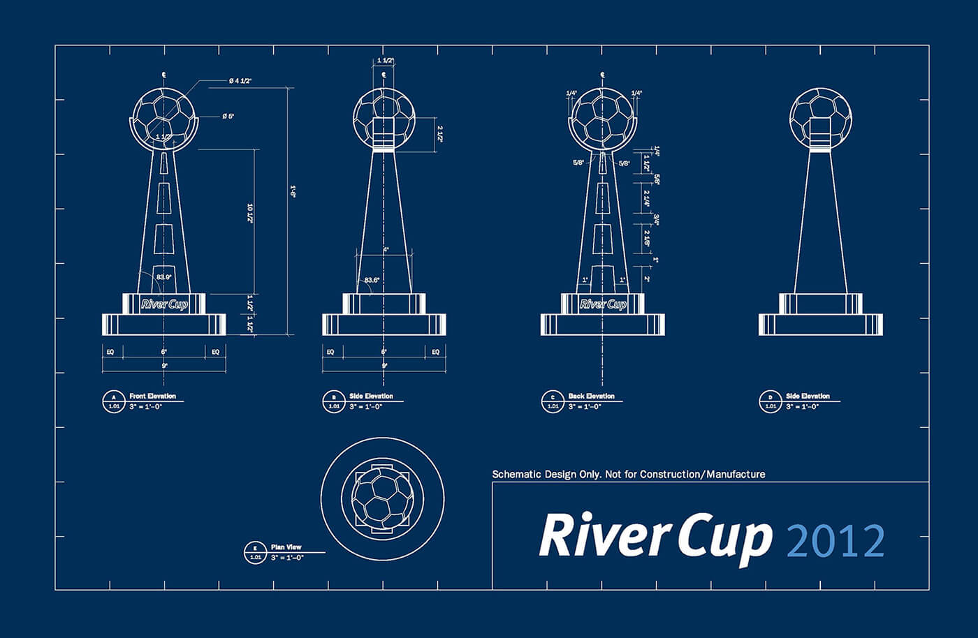
RIVERCUP 2012
2012 saw the second staging of the River
Cup; a soccer match between the technical staff and front office of the Philadelphia Union and the supporters group, the Sons of Ben. Similar to last year, there were several marks designed for the event from detailed web banners and mastheads to simplified gameday patches for the team shirts, and merchandise for the attendees to purchase. What made this difference to last years work was that this year the program was split into three distinct visual languages: the identity of the event underneath the Union Foundation umbrella, The SoB team identity and, finally, the look and feel of the graphics for the supporters group that would be used on social media platforms in order to build interest and momentum towards the event. For the SoB and Supporters graphics two unique typefaces were developed to add character and distinction to the communications. Photos courtesy of Earl Gardner and Garrett Field.